As a part of our continuous efforts towards modernizing the Rubrik SaaS platform, we recently added multi-theme support. We offer Bright and Dark themes, promoting consistency between different applications.
Themes specify the colors of components, the darkness of the different surfaces, the level of shadow, and more. Themes allow us to apply a consistent tone and customized design to our product and improve the accessibility of the Rubrik user interface (UI) for users of different abilities.
The UI team at Rubrik drove this project to completion, but this was truly a collaborative, cross-functional effort. We worked with the design team to ensure our created components were theme-compliant and visually appealing. We included internal teams like product management and manual testing in addition to collecting direct feedback from our customer focus groups to validate our work. Following this process ensured we had the best possible outcome and that these updates truly made a tangible impact for our customers.
The technology behind this update
We used the Emotion library to customize our front-end components with theme-specific colors. Emotion is designed for writing CSS styles with JavaScript. It provides powerful and predictable style composition in addition to a great developer experience with features such as source maps, labels, and testing utilities.
Since we built the Rubrik SaaS platform using React, we use the “@emotion/react” package. Some of the features we leveraged are:
CSS prop support
Similar to the style prop, but also has support for auto vendor-prefixing, nested selectors, and media queries.
Allows developers to skip the styled API abstraction and style components and elements.
The CSS prop also accepts a function that is called with your theme as an argument, allowing developers easy access to standard and customizable values.
Reduces boilerplate when composing components and styled with emotion.
Theming works out of the box.
ESLint plugins set proper patterns and configurations in the application.
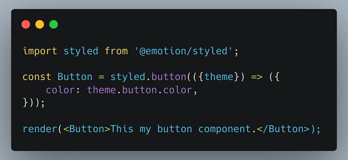
We define theme configurations for all themes, which contain the color, opacity, and more for all the components which need to be themed. The theme configuration type is defined as shown below:

Here, the component receives its style information from the theme variable configured inside Emotion, which contains the corresponding data for all the elements in the application.
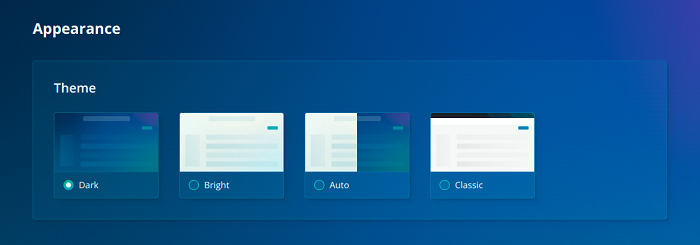
Users can select their desired theme using the theme selector on the application settings page. Click on the user icon (Manage user account), select ‘User Preferences’, and then click on the ‘Appearance’ tab on the left to view the available themes as shown below:

The theme preferences are read from the user’s system to determine the default theme for that user.
The theme set for each user is stored in the user settings database and the local storage, allowing us to display the selected theme even if they switch browsers/desktops.
Once a user changes their theme, the local storage value for the theme is updated. We have added an event listener for the local storage value, and whenever it is updated, we update the application theme accordingly. When one tab of our application updates the selected theme, all the other open tabs also update the theme, ensuring theme consistency across multiple browser tabs.
Improving accessibility for our customers
When making design changes, it is essential to be mindful of the diversity of our users and inclusive of their needs and circumstances. In addition to visual impairments, users may be affected by hearing, cognitive, and motor limitations when browsing a website; others may have a different social or cultural background that may alter their understanding of our content. These circumstances may be permanent, as with color vision deficiencies (CVD), or temporary, as with browsing on a smaller screen with a slow internet connection and poor graphics.
The themes in our application focus on visual impairments specifically. The design team has audited them for accessibility and made sure they adhere to best practices like color contrast, readability, and ease of access.
A theme is more than color and layout
Good themes improve engagement with our product in addition to making it beautiful. We must recognize that visual appeal is an important aspect of today’s web development practices and is essential to growing the business.
Projects and initiatives like these make Rubrik a better experience for our customers. Learn more about how you can impact customer outcomes and experiences by joining the Rubrik team. See what opportunities await you here.
